

A/b Test for safeco+ Subscription rates
Background
Liberty Mutual implemented a new way to sign into their Liberty+ and Safeco+ sites that involves using LM’s login service. This would now only allow users to sign into Liberty+ and Safeco+ sites with their policyholder information, the same login credentials they use to sign into LM’s site to view their policy information.
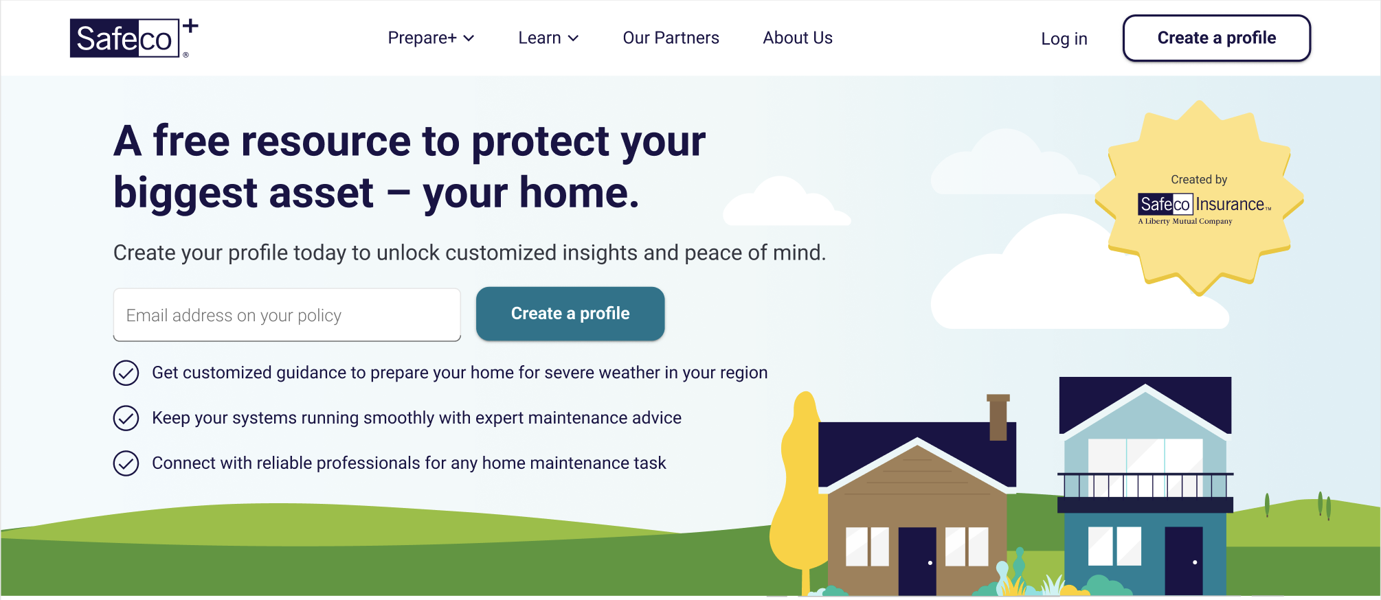
previous state
The previous state included an input field with a “create a profile” button, and the typical “login” and “create a profile” in the site navigation. We thought, with the only new option being to technically login with their existing credentials, this might come off as confusing to “create a profile” accompanied by ability to put an email address in. We also theorized that this input field could cause a lot of errors due to the fact that many people may not realize they have to use a specific email address (even with the input label being clear).
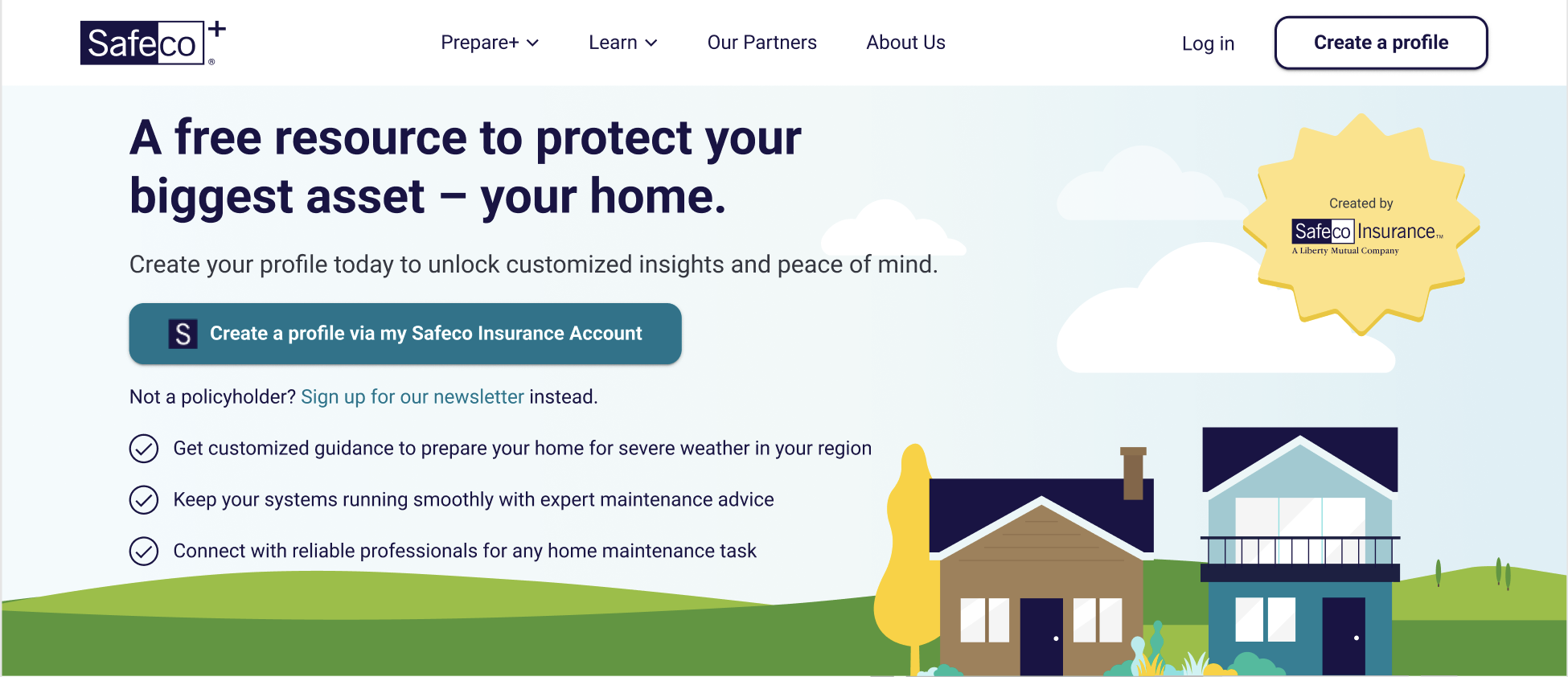
The UX proposal
A simple change with clear understanding and expectations of what’s to come next, we proposed using a single button that outlined how you can sign up if you’re already a policyholder. We believed that this idea of “self-identifying” got the user to the place they needed to be quicker and with less confusion.
Why this matters?
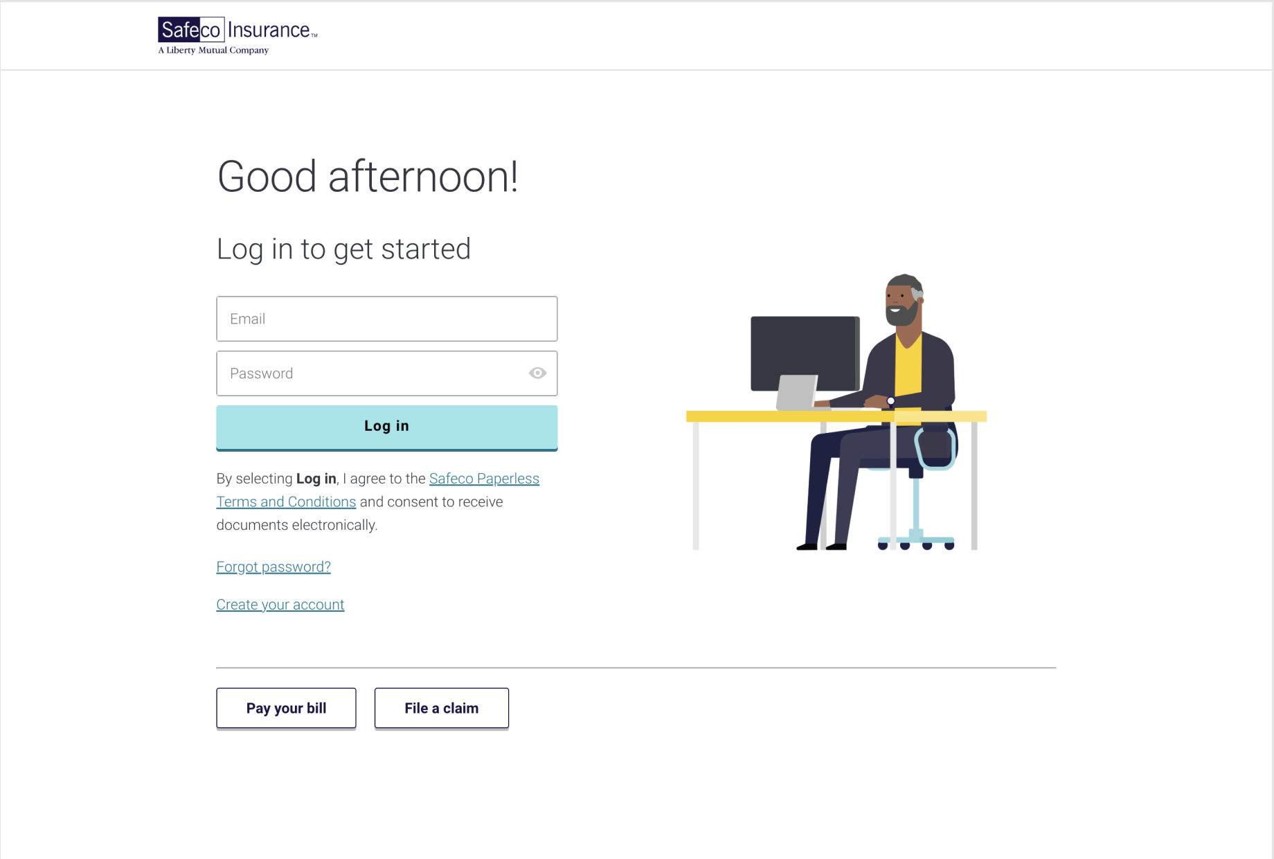
In either scenario, the user would be taken to the same screen (shown here) regardless. With the input/button combo, users would have to input their email, click submit, then have to enter their email yet again because the two systems could not talk to each other and carry-over that work. This scenario also led the possibility of L+/S+ sites not recognizing an email because the one input was not associated with an account (unclear instructions). With the single button, they only have to do the work once and the button label sets a very clear expectation that the user will then be taken here to input their policy credentials in order to login.
We have a winner
After sending an A/B test to our users during a marketing campaign, it was found that they were much more likely to sign up or login with their existing credentials when the simple button was presented to them over the input/button combo. Simplicity and setting expectations wins again! This further implies that usability heuristics and not breaking patterns is always an important consideration in any user flow design. How can we make the most predictable and easiest experience for our users? Give them what they expect, what they’re used to, and make it easy for them to do it.