Ting for Liberty+
Background
Liberty Mutual wanted a way for their current policyholders to take advantage of a program that involved receiving a free Ting device after verifying personal information. LM requested that this be hosted on their daughter site Liberty+.
previous state
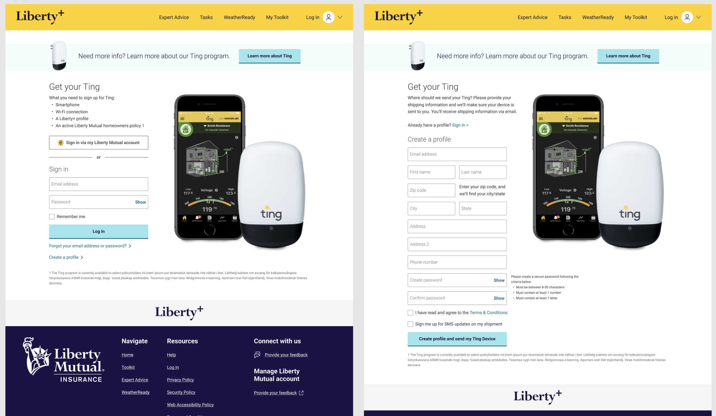
Liberty+ already had a Ting page with low conversion rates on their site. The flow started them on an informational page with a lot to look at and read. Once the user says they’re ready to go, they are taken to a sign up page that prompts them to login to Liberty+ or sign up. This commitment and extra work, I felt was the downfall to the program working.
Considering the homepage
I started my thought process off by separating the user groups into “I’m ready to commit” and “I need more information”.
For those that were ready to commit, they still needed to verify their information with us in order to proceed. I decided to put these inputs on the homepage to not take them to yet another page to reduce potential load times or drop-offs. It’s positioned on the hero section of the page so they can do this quickly and easily.
For those that needed more information first, I rearranged the selling points in a way that outlines the most important question of “How does this work?” an important question that many had if they were hesitant to sign up.
I had made a suggestion to collect only the information needed for signing up and verification so a user had to do as little as possible. I also suggested to remove the Liberty+ sign up. Unfortunately, Liberty Mutual was sending out emails directly to policyholders without any context to Liberty+, and the ask was to convert Ting users, not Liberty+.
With these changes being made, we saw a significant increase in policyholders signing up for their free Ting devices. However, LM discontinued the program due to cost of sending the free devices to users. A UXUI success!
putting it all together.
Watch the video below to see the full user flow from entry point to the site, to receiving a success screen or denial screen. Please note this is not a linear experience at the end, I wanted to make sure both the success and denial screen were visible for presentation purposes.


